


Reviewed by: Madhur Kathuria
In product management, development must stay on track and finish when promised. Whether the product is for customers, clients, or internal stakeholders, making and meeting their commitments is essential. Failing to meet those commitments can ultimately lead to wasted money and poor product results.
For agile teams (and scrum teams who choose to use them—no chart is required as a component of scrum), a burn-up chart is a visual tool for tracking the work completed over time, used to understand progress and remaining effort.
Over time, burn-up charts help to establish how effectively the team completes work over multiple sprints, allowing them to estimate how many sprints it will require to complete a product. With this information, teams work more efficiently, make commitments they can keep, and deliver high-quality work.
What Is a Burn-up Chart?
A burn-up chart is a graph. The vertical Y-axis represents scope—in story points, issues, estimates, etc. The horizontal X-axis represents time, usually in days. The point of this chart is to show how much work has been completed against the team’s total work or scope.
The benefits for a scrum team are that the chart helps the team to:
- Track their progress
- Manage scope changes
- Make informed decisions throughout the development process
Another feature on these charts is an ideal line that shows how the work pace would proceed in a perfect world to meet the deadline. As teams complete work throughout the sprint or iteration, they can compare their actual speed of work against the ideal.
With the easy ability to track work completed against a deadline or projected completion date, a burn-up chart gives teams a real-time visual of their progress against their commitments. It helps them see if they are consistently making deadlines over time.
What’s the Difference Between a Burn-up Chart and a Burn-down Chart?
These two tools tend to get confused with one another, but they don’t track the same thing.
A burn-up chart tracks complete and incomplete work during a product’s development, sprint, etc. Visually, the lines are tracked upwards on the graph, showing progress from zero to 100% completion from bottom to top.
A burn-down chart is different, and another tool that scrum teams may use to track the amount of work remaining on a product or sprint. These charts start from a known start point measuring story points, PBIs, or hours of effort from 100% to zero. Visually, the lines track downward on the graph from top to bottom.
How Do Burn-up Charts Help Agile and Scrum Teams?
Burn-up charts have these benefits for agile and scrum teams:
- Keep track of how much work is left on a product or sprint
- Based on the progress rate so far, show whether or not the team can expect to finish the product, backlog items, story points, etc., on time
- Show clients and stakeholders the progress and how much longer the product development will take if they want additional work added
- Quickly recognize and solve problems related to the scope or progress of the product
- Improve communication and transparency within scrum teams
- Monitor and determine a team’s overall scope—especially if working in sprints—it’s easy to see how much work the team completes consistently
- Use the data to plan future products and sprints effectively
- Creates transparency between team members and stakeholders about their work
Once a team completes a few burn-up charts, it can give the team valuable insight into their scope. The team can accept more work if they consistently complete it before the sprint or product development ends. If work still needs to be completed at the end of the sprint(s), they are trying to do too much.
When the teams know exactly how much work they can complete in a given time, they become more predictable, which helps the accuracy of planning future sprints and product commitments.
How To Make A Burn-up Chart
Some teams use software programs for product management, like Jira or Asana. These programs track sprint length, backlog items, story points, etc. A benefit to using these programs is that they will automatically create burn-up charts per sprint.
These programs typically house the team’s backlog and are organized by sprints. The work they accept into the sprint creates a kanban board that separates tasks into to-be-done, in-progress, and done categories throughout the sprint.
While these programs are the easiest way to generate burn-up charts, they can also be done manually or in Excel.
Steps for creating a burn-up chart:
- The horizontal axis (X) shows increments up to the total duration of the product development or sprint—i.e., days, weeks, months, etc.
- The vertical axis (Y) represents the total amount of work—i.e., story points, PBIs, hours of effort, etc.
- Plot your trend line for planned work over time by plotting the start where X and Y intersect at zero and the endpoint up to the right and connecting a line between the two; this line is the ideal progress trend.
- As work progresses, plot the completed work at the end of each day, sprint, or whatever reporting period you’re measuring.
- Compare how actual progress compares to the ideal trend.
Burn-up Chart Example and How to Read It
Here is an example of a burn-up chart in scrum:
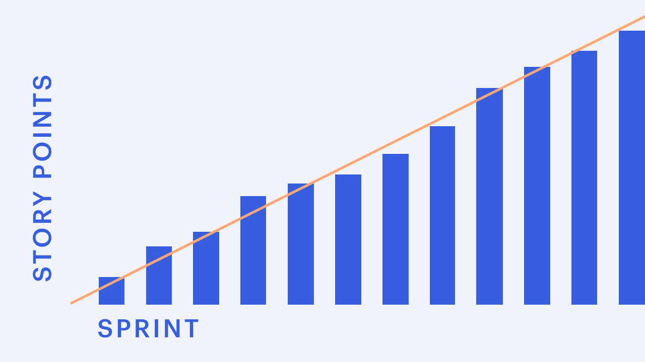
The peach line is the ideal trend of completed story points throughout the sprint.
The blue bars are the number of story points completed and when during the sprint.
Tips for reading this chart:
- Changes in the peach line indicate the baseline plan for story points or sprint duration changed.
- You’re behind schedule if the blue bars are beneath the peach line.
- You’re ahead of schedule if the blue bars are above the peach line.
- Deviations from the ideal trend can indicate changes in staff, sick employees, bottlenecks in work processes, etc.
Use Burn-up Charts to Your Advantage
Ideally, the developers update the burn-up chart as they complete their work. Since teams are self-managing, they should be diligent in being transparent about their pace of work. Sometimes, the scrum master may help the team update the chart, but the entire team is responsible for updating it.
Some teams may use the burn-up chart and only update it and review it at the end of the sprint. But, if it’s a tool to track progress, it might not help to update a burn-up chart at the end of a sprint. If you’re not checking in daily on your progress to completion, how do you know you’re on track?
Most importantly, burn-up charts should be used as a practical tool, not to punish a team. It’s a positive tool that helps facilitate communication and transparency rather than a way for anyone to micro-manage the team.
With burn-up chart information at anyone’s fingertips, it’s easy to adapt work as needed throughout a sprint to ensure scrum teams deliver completed work on time. With the ability to consistently make and meet commitments, teams become predictable, can better estimate the scope for the next sprints, and know that they are performing their best—instead of being bogged down by endless tasks they feel they can never complete.
Build confidence in how you work
Get a clear understanding of Scrum’s foundations and learn how agile teams collaborate to deliver real value. The Scrum Essentials microcredential helps you develop the knowledge and vocabulary to contribute effectively in any role.
About the author

We’re committed to equipping professionals and their organizations with the education, skills, and community needed to succeed in today’s ever-evolving workplaces.